- Tim O'Hearn Here
- Posts
- Cover Art Mistakes (+ First Podcast Appearance)
Cover Art Mistakes (+ First Podcast Appearance)
Resolving minor issues with the book's cover
Tim O'Hearn
March 07, 2025
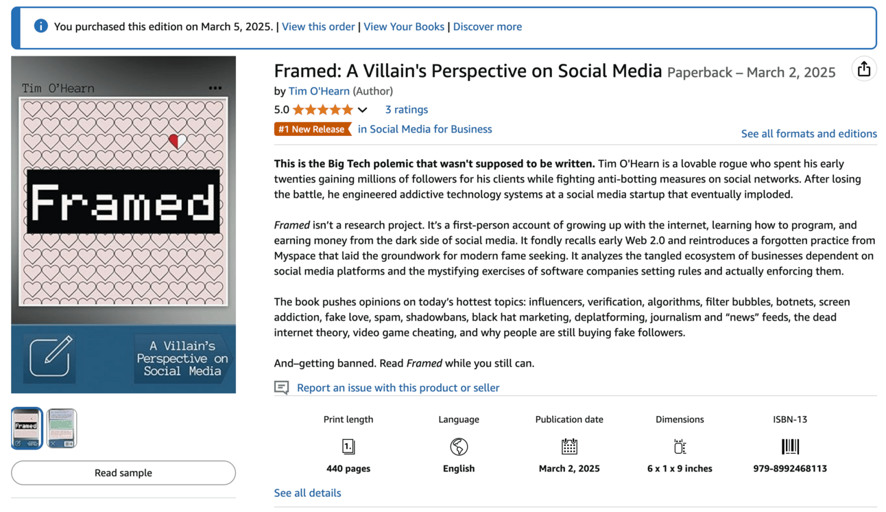
Thanks to early interest in the paperback version of Framed, the book briefly reached the #1 New Release ranking in “Social Media for Business.”
This is different from eBook rankings in that the sales count only when a copy is printed and shipped. So, the rankings lag behind the actual purchasing activity. I want to rank highly, but this is the stage where I’m starting to rely on feedback leading to greater “social proof.”
I designed the book cover myself, if that wasn’t obvious. I think it stands as a unique and eye-catching work in a sea of iterative content that screams “AI!!!!” and “I hired the same designer as the last twenty authors!” A future post will explain all of the motifs.
I’m writing this email because I reviewed a few of the first copies of this 440 page edition, and there were some things I didn’t like. A few minor mistakes and a few things that didn’t render quite right.
I’ve asked a few people, and nobody has highlighted anything specific, but it’s important to me that the cover is pixel perfect.
For the old 466 page version, I had requested proofs and I had noticed a few issues, some of which I solved, some of which I thought some were printing errors. I didn’t request proofs of the 440 page version—I wanted to get the book out as soon as I could.
I’ve now fixed the issues and the new design was approved this morning.
If you were one of the twenty or so people who immediately purchased the paperback and you want a cleaner version, email me proof of purchase and I’ll ship you the new version.
If not, it’s not too late to buy copies of Framed—it’ll be listed at $14.99 for a limited time.
You are probably wondering, “What were the errors?” I’ll disclose them here and explain what happened. If you have the book with you, you can reference it and maybe learn a little about what happens when software engineers trying to be writers also try to be graphic designers.
The bleed on the spine was off by roughly 6px
For some reason, Amazon’s cover template provides a dashed line for the cover “fold” which is thicker than 1px. It wasn’t clear to me whether I should have set my guides to the start, middle, or end, of these thick dashes. I thought the middle was fine, and it looks okay, but I realized that for a contrasting color spine, I should overlap the entire line. That was good for 3px on each side.
The bevel/emboss of the spine didn’t look good with the bleed, including a very slight unnatural color transition as it intersected with the bottom ribbon
I don’t know why I decided to put a bevel/emboss effect on the top (left) of the spine. It didn’t work well with the page fold and made issue #1 more noticeable. I removed this entirely.
The vertical alignment of the buttons on the bottom ribbon was off by about 10px
There was more space below the buttons on the ribbon than above them. I had measured this using the ruler in Photoshop and done manual adjustments, but I either didn’t save or didn’t check my work. It was off by about 10px, maybe a bit more when considering I was excluding the thickness bottom “bleed” line. I’m now also accounting for that thickness
There were a few errant pixels on my hand-drawn pencil icon
Because image copyrights are ridiculous, I designed the heart and the “write post” icons on my cover using Photoshop. No borrowed elements, nothing traced. I drew a heart. I drew a pencil. The pencil had a few pixels out of place where the draw tool had overlapped. This was barely visible on the cover but it’s fixed now.
The shadow on the bottom left corner of the back cover was displayed by about 20px so appeared to “stop” short of the end of the page
After expanding the low-resolution eBook cover to the paperback version, I didn’t notice that the back shadow had snapped to an internal guide line.
There was too much vertical negative space around the buttons
I expanded the height of the bottom ribbon without increasing the size of the buttons. It didn’t look awful, but there was too much negative space. I increased the button areas by about 10% and realigned everything.
I don’t want anyone to feel like a beta tester, but this is self publishing. If you see an error on the cover or within the book, you actually might be the first person to notice it. Reach out to me!
If you’ve read this far, I’d also like to share that I did my first two podcast appearances this week. Dan Hafner of TechBytes had me on and the episode was released this morning. I’m thankful to him for having me on, and I’m looking forward to a few more appearances that I have scheduled.
If you know a podcaster who might like to have me on, let me know. I’m working on saying “uh” less.
Reply